Colour in Quilts: Building a Palette That Works
Two quilts can use the same fabrics and the same pattern and still look completely different, because colour in a quilt is not really about colour at all. It is about value, which is how light or dark each fabric looks beside the one next to it.
Building a quilt colour palette is the part of planning I enjoy most, and it is also where the most mistakes are made at the cutting table. Here is how I choose colours and, more importantly, how I test them before a single square is cut.
Value Comes Before Colour
Value is how light or dark a fabric appears, and it is what the eye reads first at any distance. A quilt with strong value contrast looks lively and clear, while one where everything sits at the same value looks flat no matter how bright the individual colours are.
Photograph your fabrics and turn the image grey. In grey, colour disappears and only value is left, and fabrics that looked different may suddenly turn out to be the same tone.
The usual advice is to plan a mix of lights, mediums and darks, with the darks in the minority. That proportion is not a rule to obey but a starting point that gives a design somewhere for the eye to rest.
The Colour Wheel Without the Jargon
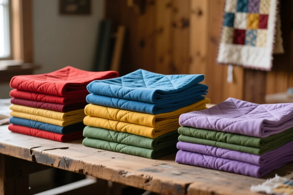
The colour wheel is simply colours arranged in the order they appear in a rainbow, with the ends joined. Colours next to each other are analogous and give a calm, blended quilt, while colours opposite each other are complementary and give a bold, energetic one.
Halfway between the two are the split schemes, where one colour is paired with the two colours on either side of its opposite. These are the palettes that feel interesting without shouting, and they are forgiving if you want something less obvious than a two-colour quilt.
Warm colours, the reds, oranges and yellows, come forward in a design, and cool colours, the blues, greens and purples, recede. That single fact explains why a small warm accent can hold a whole quilt together.
Building a Palette From One Fabric
The easiest way to build a palette is to start with one fabric you love and let it decide everything else. Pull the colours out of its print rather than matching the print itself, and you have a palette that is guaranteed to belong together.
Then decide what each colour is for. The table below sets out the roles a palette needs, which is far more useful than collecting colours with no job in mind.
| Role in the palette | What it does | How much you need |
|---|---|---|
| Background | gives the design a quiet ground | the largest share of the quilt |
| Main colours | carry the pattern and the mood | a generous middle amount |
| Accent | adds life and a place for the eye to look | a small amount used deliberately |
| Dark | creates depth and contrast | enough to anchor the whole design |
Most quilts need more background than the maker expects, and fewer competing main colours. Three or four strong fabrics usually read better than eight, because the eye is given a clear pattern to follow.
An accent fabric works best when it appears in several places rather than in one block. Scattered, it ties the surface together; concentrated in one corner, it can look like a mistake rather than a decision.
Contrast, Rest and Rhythm
Contrast is what makes a design legible. Without it, shapes merge and the pattern disappears; with too much, the quilt becomes noisy and hard to look at. The aim is a surface the eye can travel across comfortably.
Rhythm comes from repeating something at intervals, whether that is a colour, a value or a size of print. A quilt with rhythm feels intentional even when the blocks are simple, because the eye finds a pattern to follow.
Rest is the most overlooked part of a palette. Give a busy design some quiet space, often in the sashing, borders or background, and the lively parts look livelier for it.
Testing a Palette Before You Cut
Testing is what separates a quilt colour palette that works from a collection of fabric you simply like. Test with the fabrics in the proportions they will appear, because a fabric that looks wrong in a small square may look right when it becomes the background.
- Lay the fabrics out and look at them from across the room, not from close up.
- Photograph the layout and view the photo on a screen, where distance is easy to fake.
- Squint, or convert the photo to grey, to check that the values still separate.
- Cut one test block before cutting the whole quilt.
A single test block is the cheapest insurance in quilting. It shows whether the fabrics work together, whether the contrast holds and whether the design needs one more quiet fabric.
If the block feels wrong, change one fabric rather than all of them, and make another test. Changing one thing at a time is how you learn what the palette actually needed.
Using Colour You Already Own
If you have a stash, start there. Pull out everything that might belong in the palette and then remove what does not earn its place, which is much easier than trying to add a missing colour later.
The fabrics you reach for most often are the ones that express your taste, and a palette built from them will feel like yours. That is worth more than following a trend from a magazine.
A photograph and a simple editing app let you see the palette as a grey image without leaving the sewing room. It is not a substitute for holding the fabric, but it does expose problems before you start cutting.
A Palette That Reads Clearly
Colour in quilts rewards a little planning. Settle the values first, decide the role of each fabric and test the whole palette in the proportions you intend to use.
Remember that the key to a quilt colour palette is contrast rather than brightness. A quiet palette with clear values always reads better than a loud one with none.
Trust your own eye in the end. If the fabrics on the table make you want to start cutting, that is usually the palette working, and the finished quilt will show it.